Capstone Project
Creating a Cash Accuracy Flow for
POS Analytics
A product design case study for Treez.
Introduction
Context
Treez is the leading enterprise cloud commerce platform providing point of sale software, retail analytics, cashless payments and integrated partner solutions to the highest volume retail operators in the biggest state markets in the cannabis industry. Treez's innovative technology and insights help retailers streamline their growth, increase their ROI, and drive efficiency in their operations.
Role
UX Designer
Timeline
2 Weeks
Why did I pick this project ?
I wanted to do a project for a overseas remote company. Also solving for the cannabis industry seemed something new and intriguing.
Industry
B2B Cannabis
Tools

Deliverables
3
Numbers of
Screens Created
27
For Research
I Went through 17 articles, 9 reviews and interviewed 1 participant
Process Followed
Problem Statement
(Re)-Design the Cash Handling feature to help merchants have greater insight into the whereabouts of their cash thus helping them better manage their finances & ensure timely recognition of revenue.
Expected
Amount
Actual
Amount
≠
EA is calculated from the
direct sale of products
AA is cash counted from cash drawer at the end of shift/day
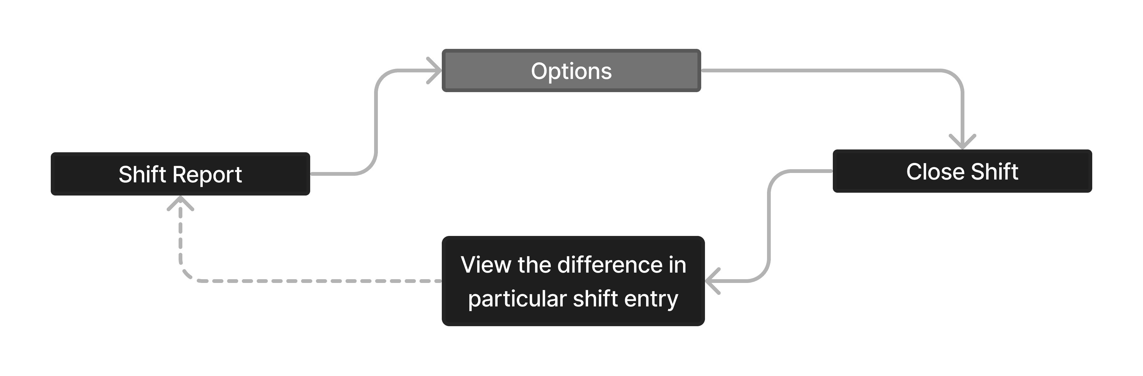
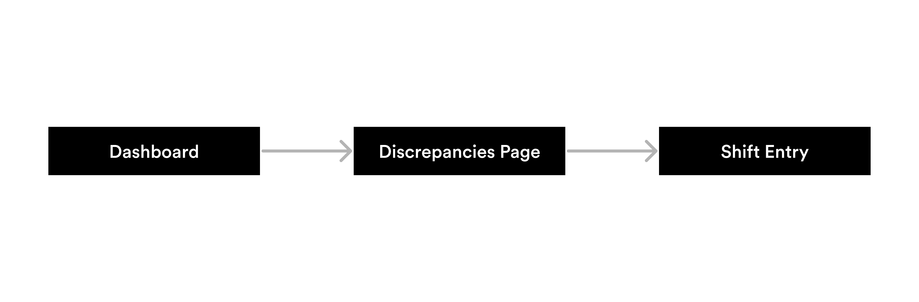
Existing User Flow
The existing user flow although seems like a linear process but it only allows to view cash discrepancy for a particular shift only. It also has a additional optional step as well.
Cash Handling
Cash Drop
Open Shift
End Shift
Close Shift
Discrepancy
Cash Accuracy
Secondary Research
Converting more customers to opt for cashless, results in better business for us…
Starting with secondary research, I began to draw from different product articles and blogs on the topic of discrepancies & business objectives. My goal was to learn more about what the customers think about the Treez Product and by achieving which business goals does Treez generates the most revenue.
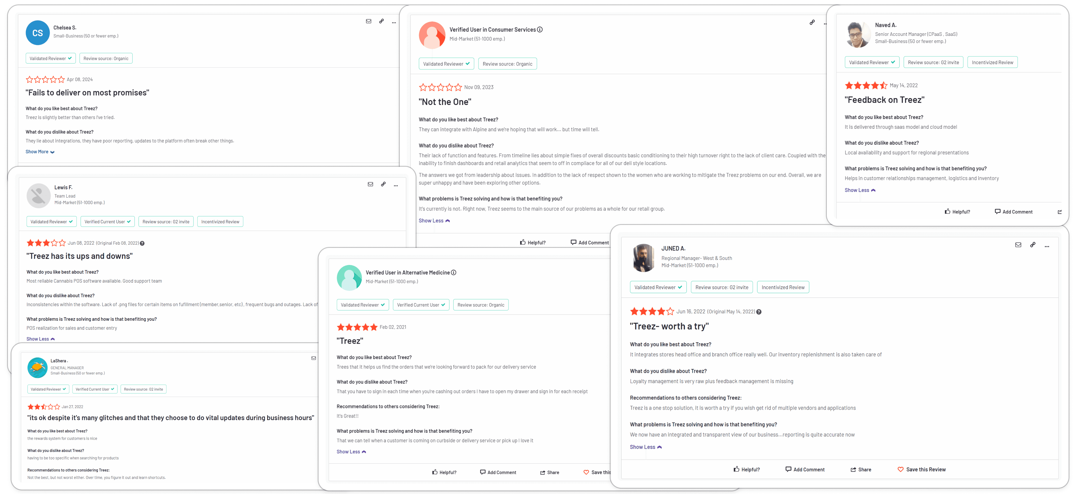
That's when I stumbled across this video about Treez from Respect My Region that said:
"Loss prevention by reducing human errors results is the most efficient way to help a business scale and grow, this leads to higher baskets + higher end consumer retention for our customers"
Competitive Analysis
The competition didn't have a well established solution for handling discrepencies
While keeping the above statistic from Treez's article in mind. I analyzed the 3 most popular players in this industry. I found that none of them had this aspect of reviewing or gaining analytics on discrepancies. Therefore this gave me a point of intervention.
Apart from this I also analyzed the User Interface of all the competitors and got the following insight:
UI shouldn’t look like an excel sheet
Even other products of the Treez Suite has a good looking UI, which isn't in tune with SellTreez.


Interview Questions & Pod Call
Cash Accuracy process is time consuming and error prone, therefore not resulting in a clean slate the very next day
I got on a pod call with my mentor who works at Treez, he was our main source of primary information. I had a chat with him regarding on what's a usual day at one of the Cannabis Retail Store in US. He also explained all the terminology that is being used in Treez. Now following are the questions that I asked and were crucial for my solutioning phase:
Qns 1. What are the current reasons for mismatch?
Qns 2. What actions do Store Manager's take do in case of mismatch?
Qns 3. What part is time consuming and where do they generally commit errors?
Qns 4. What are the other personas that might interact with the software?
Qns 5. Do they go on the paper trail or conduct regular audits?
Qns 6. What's the current way of analyzing revenue?
Qns 7. Are the people working at the store also high?
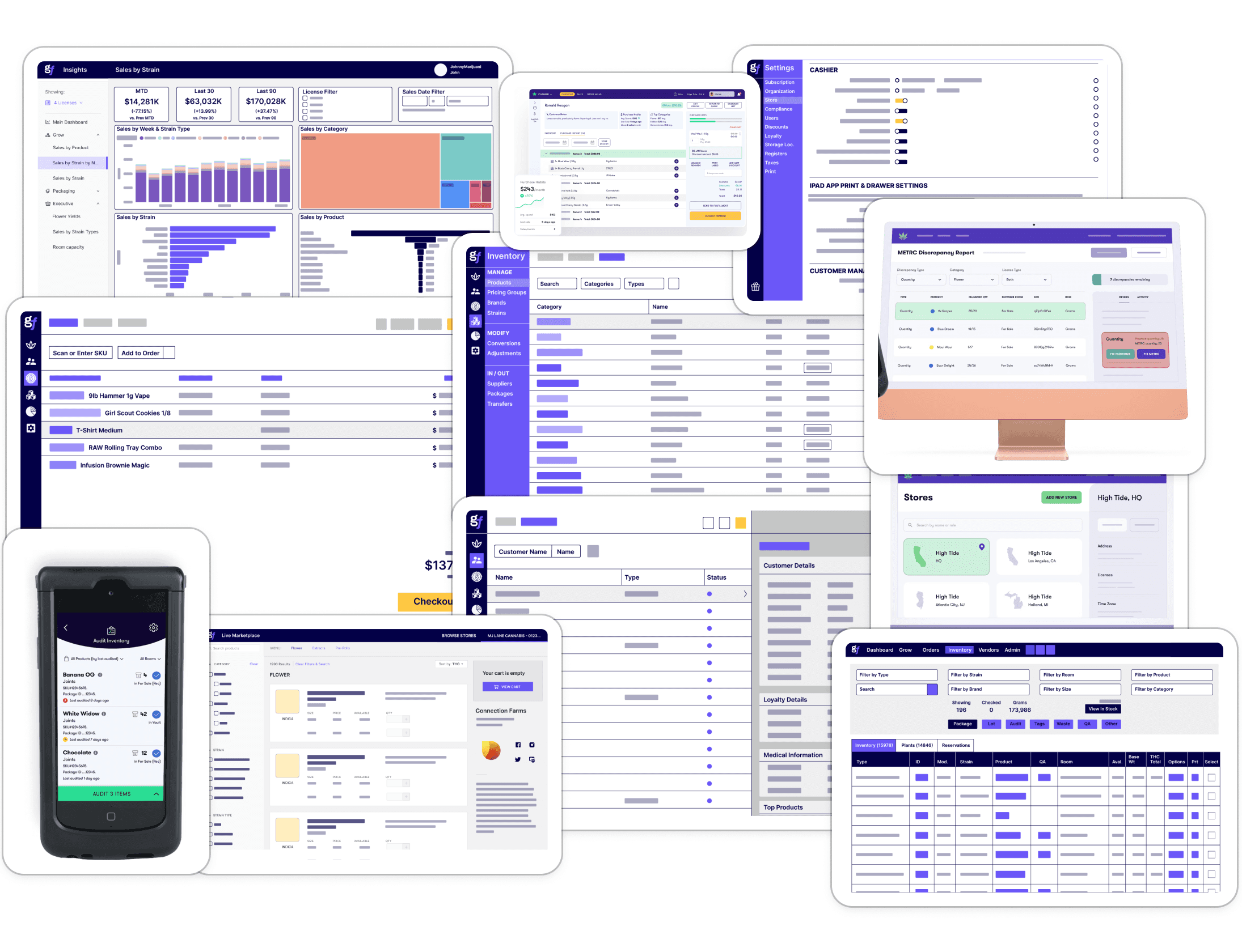
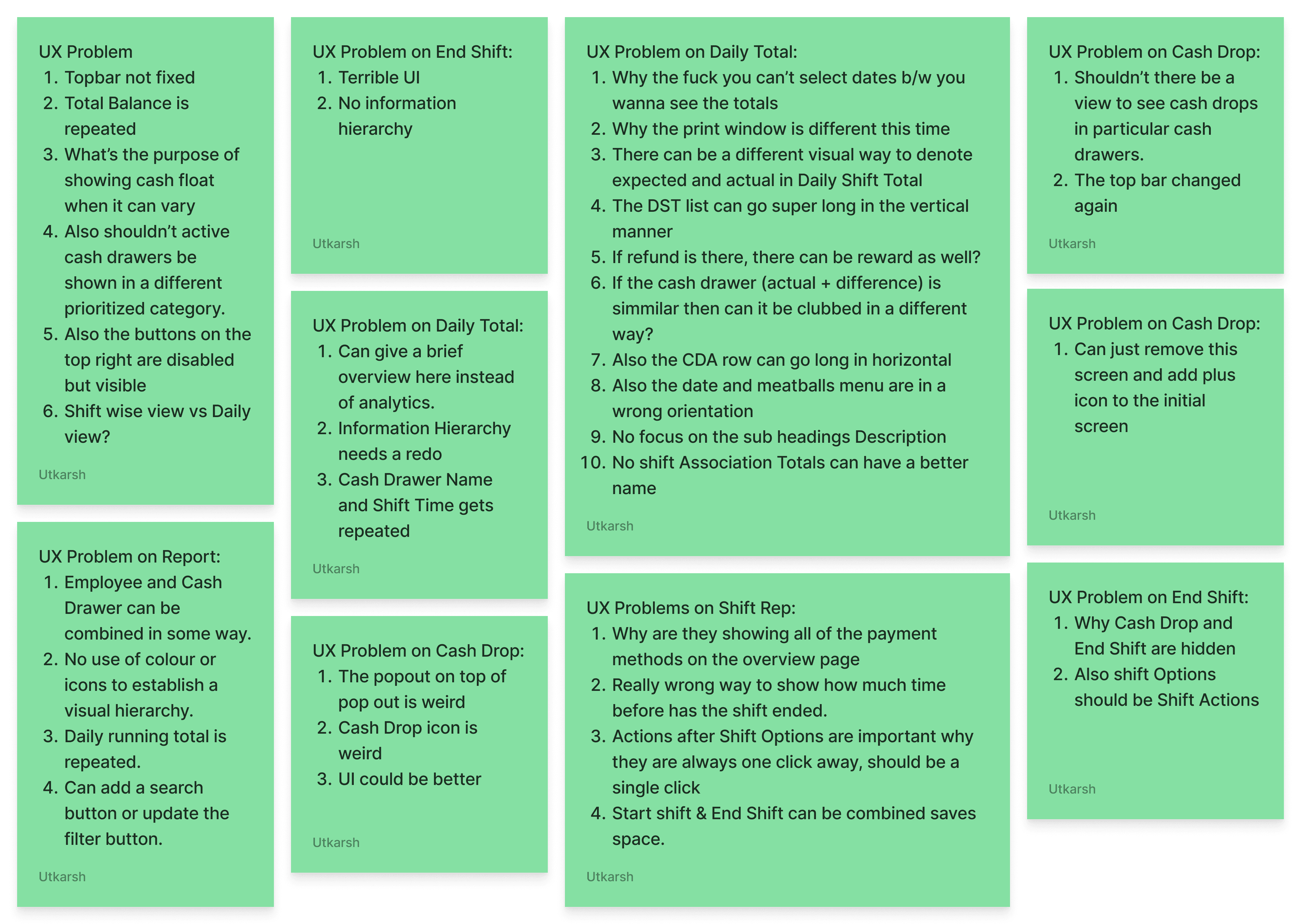
UX Audit
The next step for me to go through each screen of the Cash Handling module…
I did this to note down what are the UX problems that a user might face. Additionally, I analyzed the User Interface to find inconsistencies and to filter out crucial information that should remain relevant in the new designs
User Story
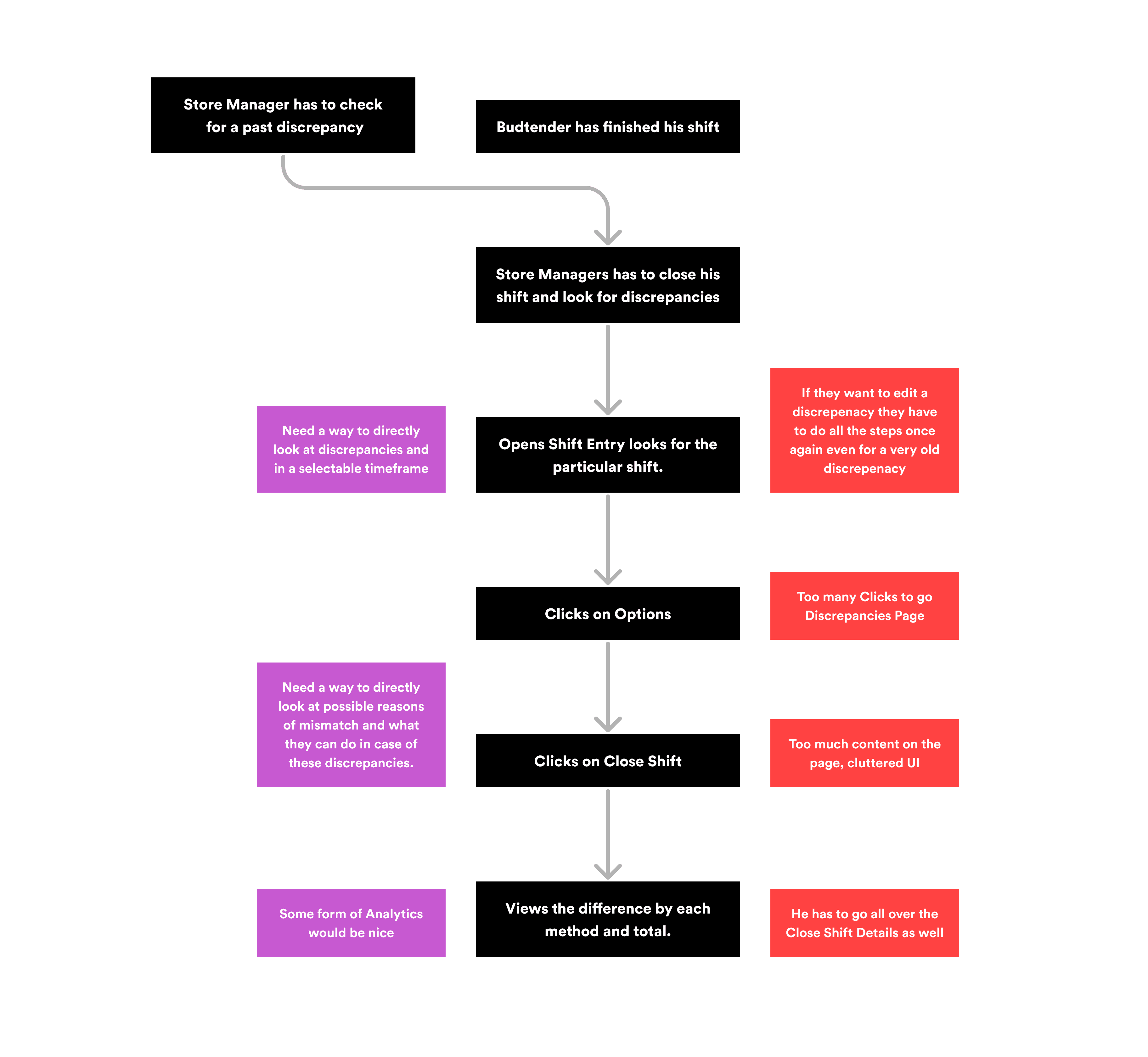
Budtender has finished his shift
Store Manager has to check
for a past discrepancy
Need a way to directly look at discrepancies and in a selectable timeframe
Need a way to directly look at possible reasons of mismatch and what they can do in case of these discrepancies.
Some form of Analytics would be nice
He has to go all over the Close Shift Details
Too many Clicks to go Discrepancies Page
Too much content on the page, cluttered UI
If they want to edit a discrepenacy they have to do all the steps once again even for a very old discrepenacy
Store Managers has to close his shift and look for discrepancies
Opens Shift Entry looks for the particular shift.
Clicks on Options
Clicks on Close Shift
Views the difference by each method and total.
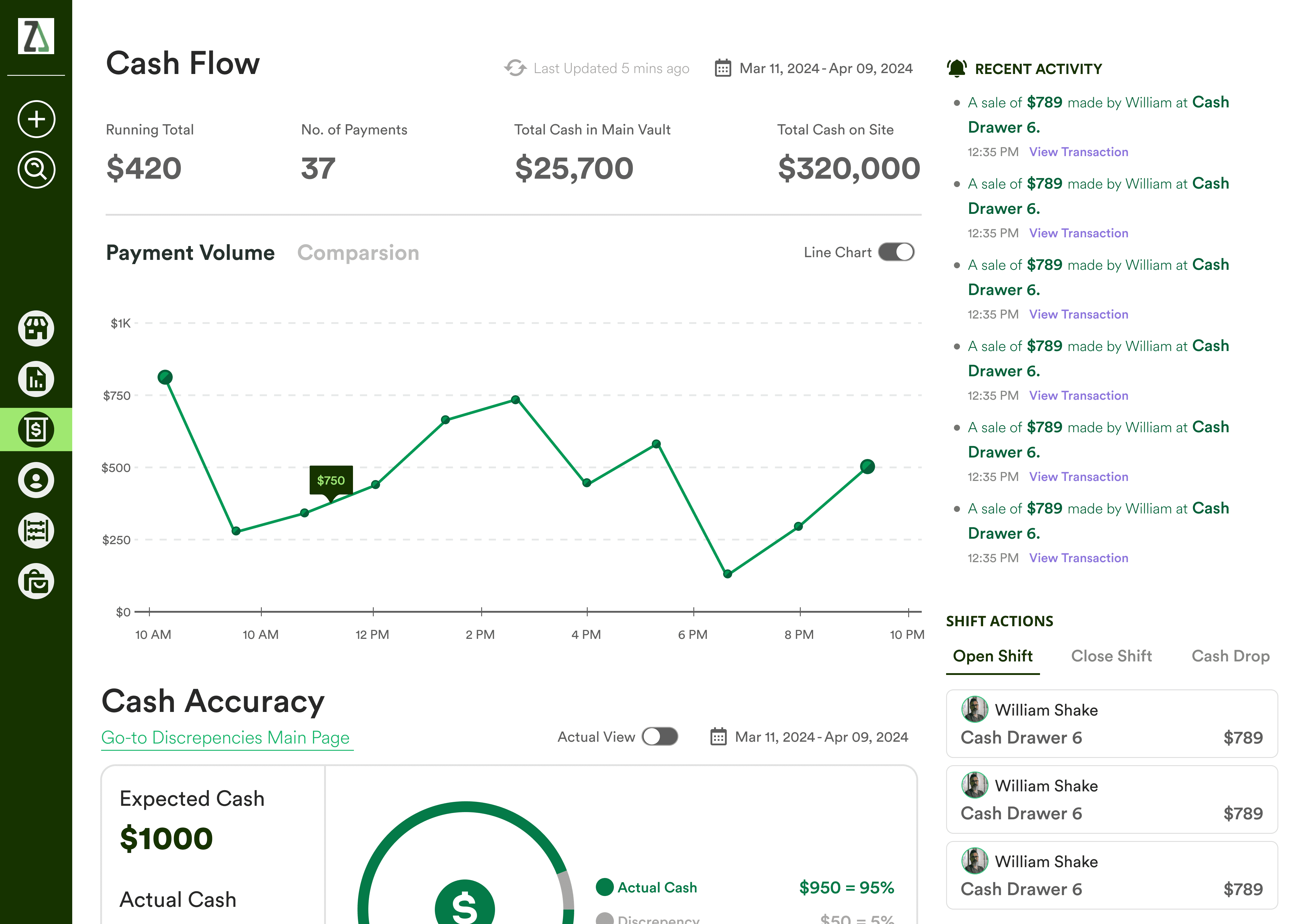
Areas of Design Intervention
Initially I misunderstood the problem statement, I started to work on the overall IA of the overall Cash Handling Module. This was taking too much time and it was out of scope. Therefore,
I decided to create a flow of discrepancies in the Cash Handling module.
New User Flow
I planned to achieve this by starting from a dashboard like place for everything cash where you can further look into discrepancies by going to its dedicated screens. After concluding the primary research I concluded that it should ultimately end at a shift report.
Ideation & Solution
3 major improvements in my design
Based upon the feedback from my peers at 10kdesigners + my mentor, I came up with 3 major improvements for the
Cash Handling Module.
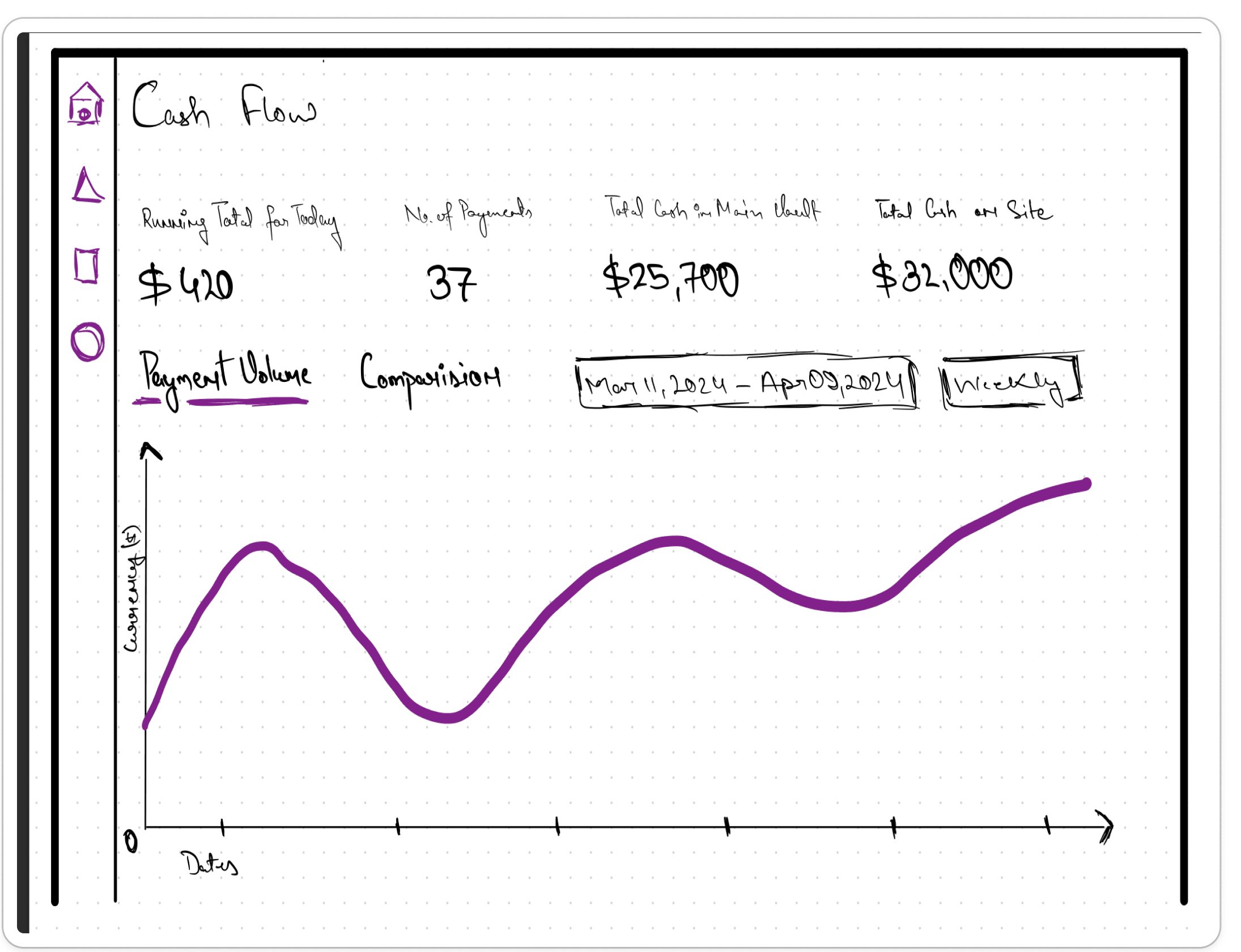
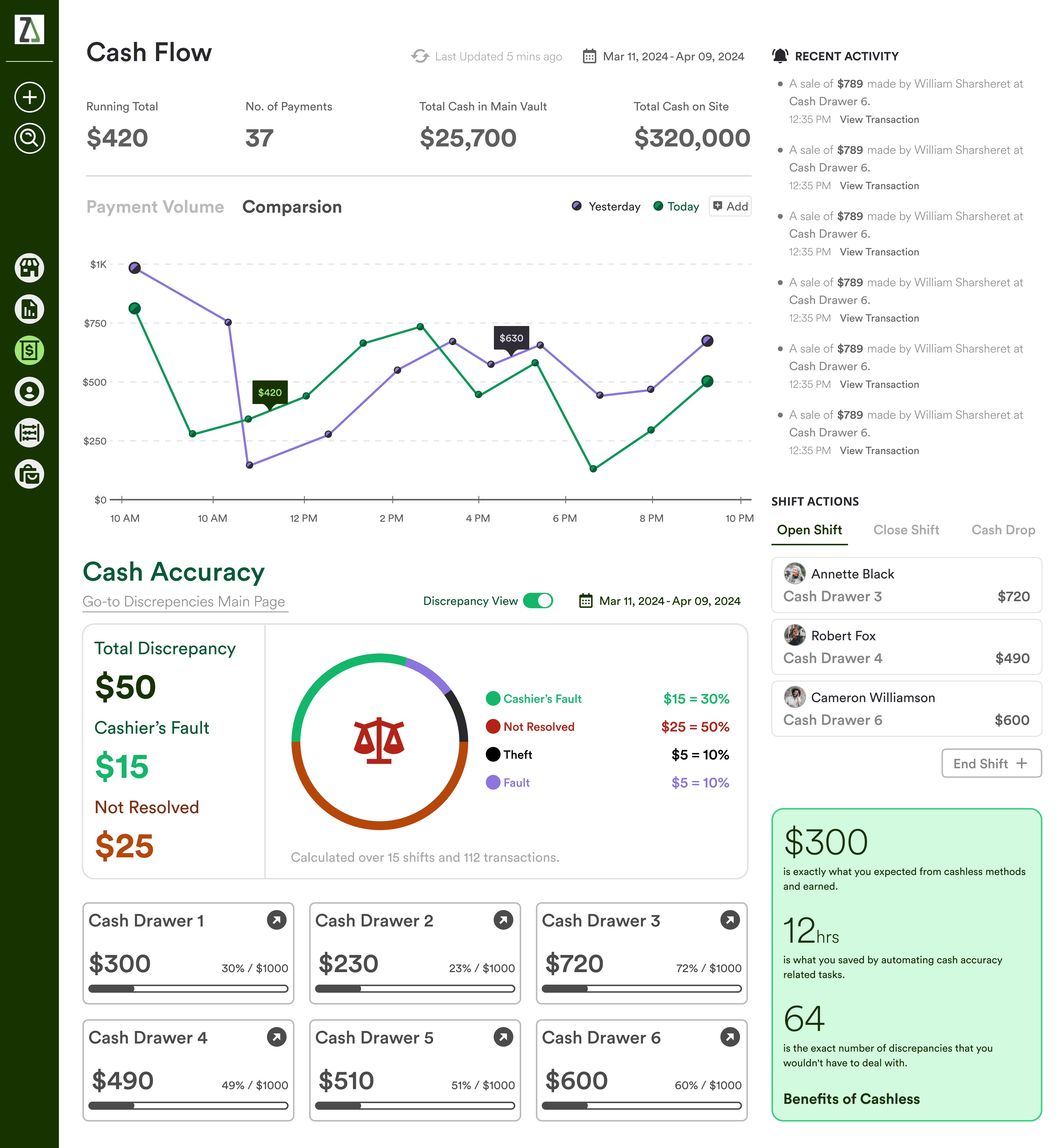
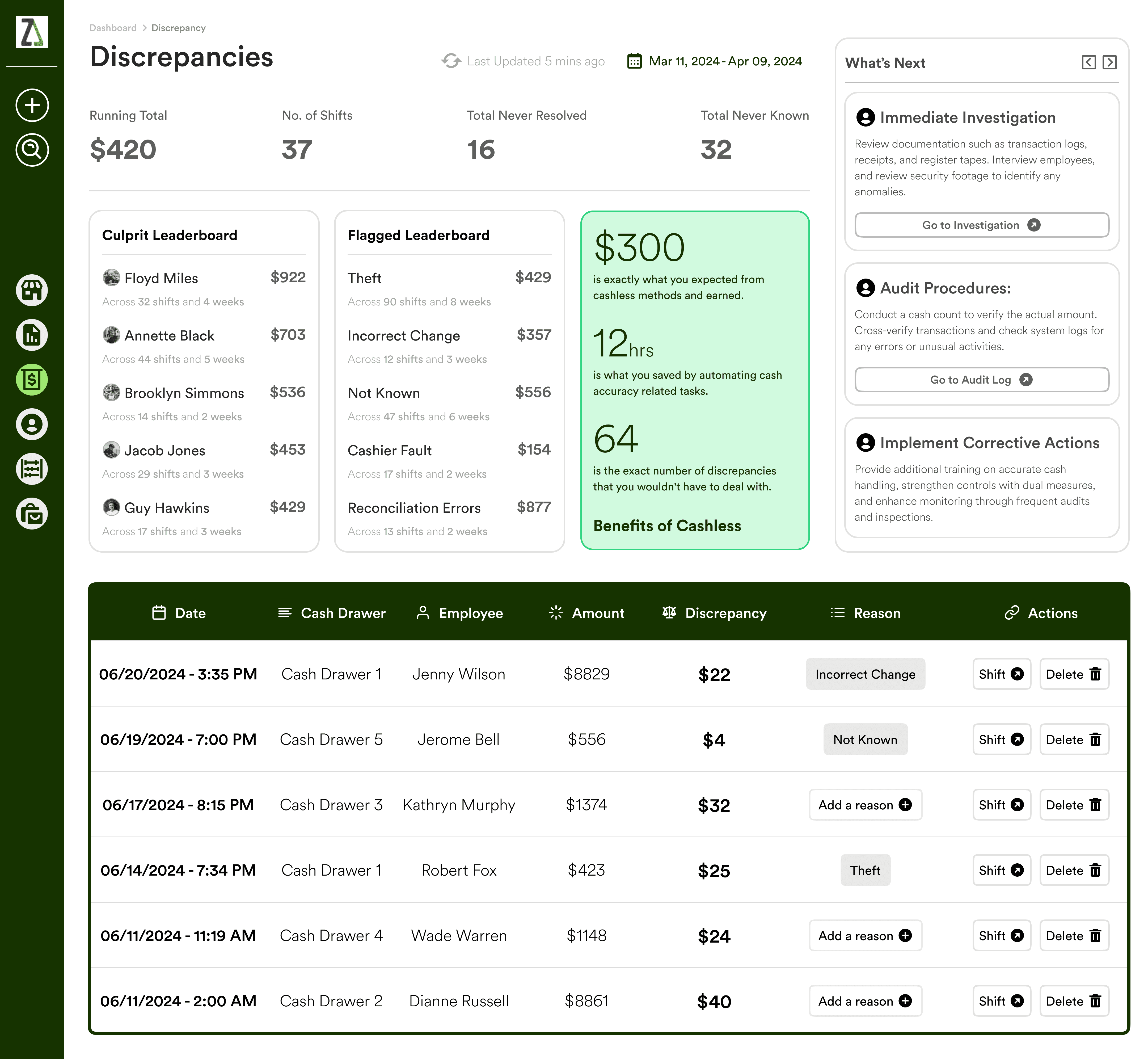
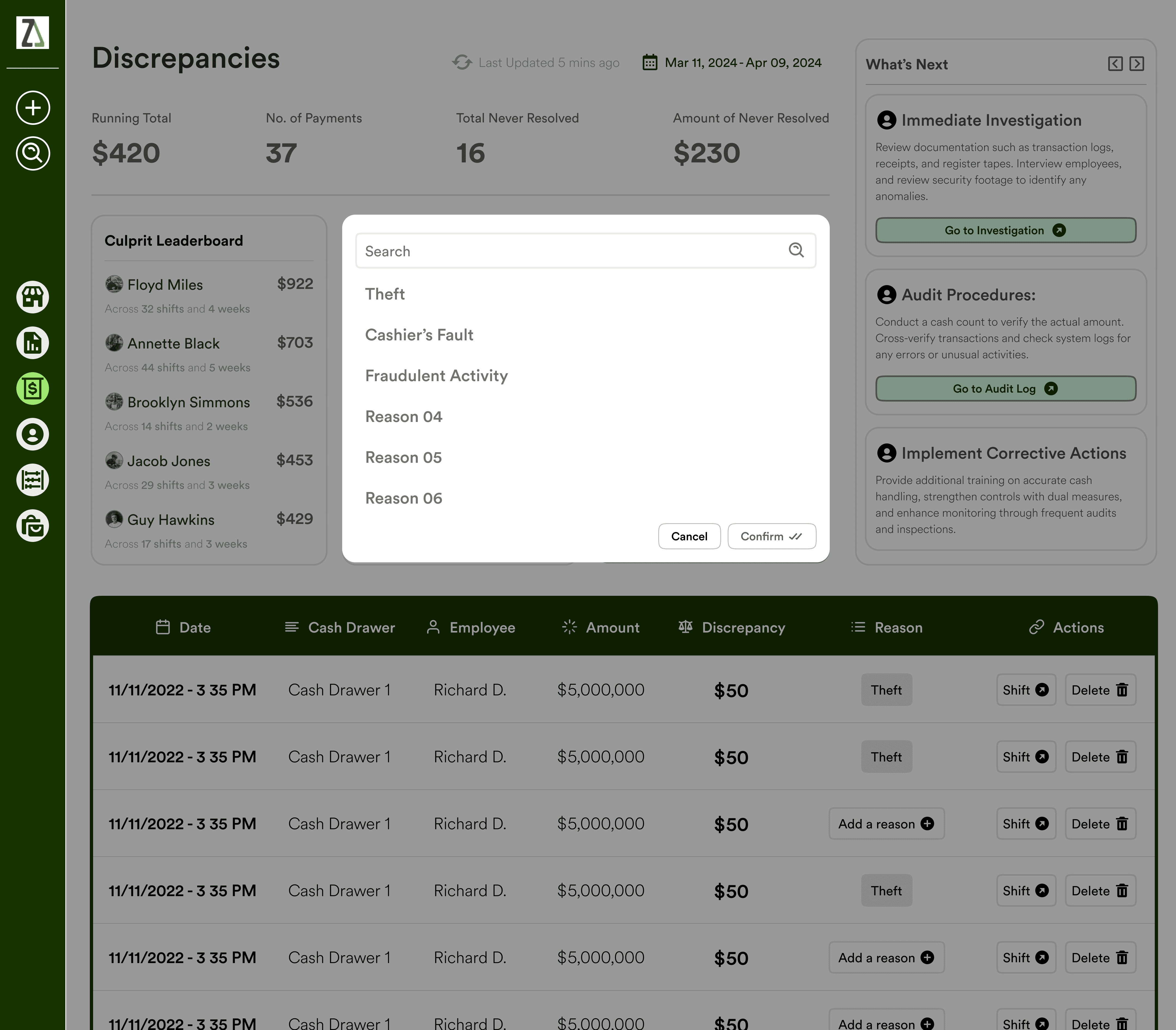
Cash Analytics
based upon payment volume
As the earlier screens didn't have any form of summary for how much revenue has been generated in the past.
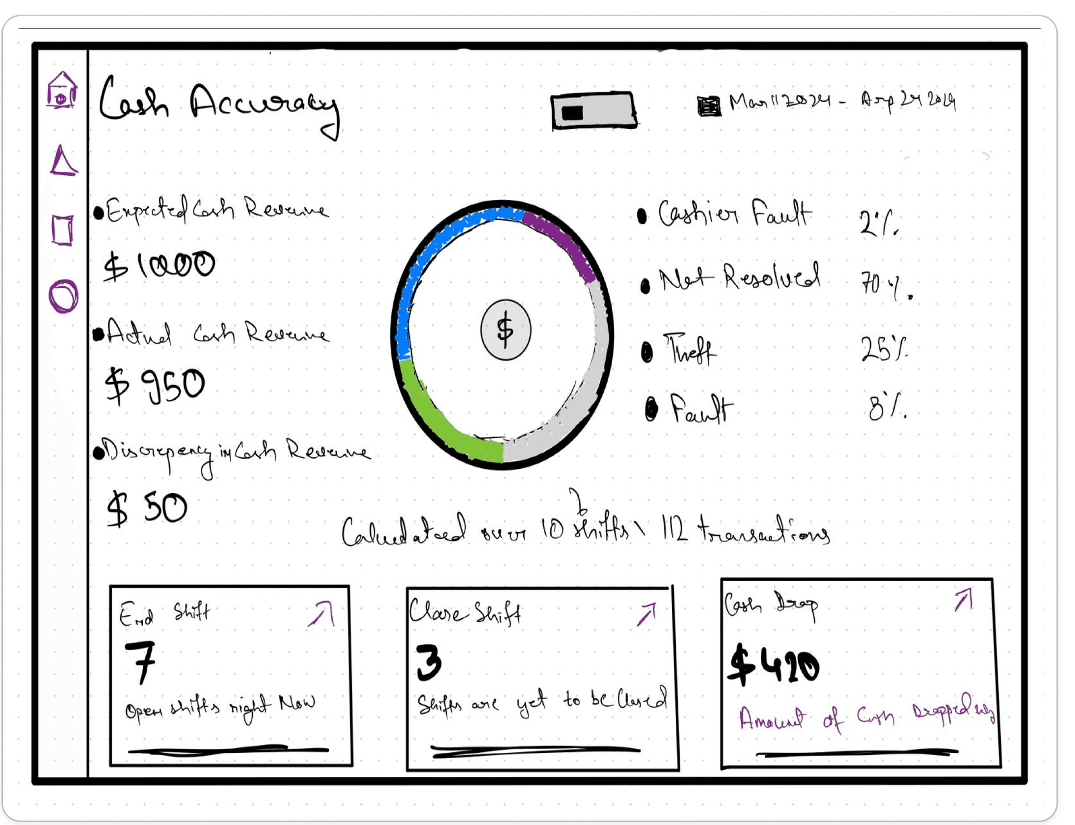
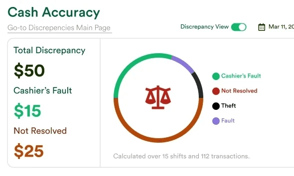
Cash Accuracy
overview & Cash Drawers
A dedicated section in the new dashboard that gives details about the amount of discrepancies and the float amount in respective cash drawers.
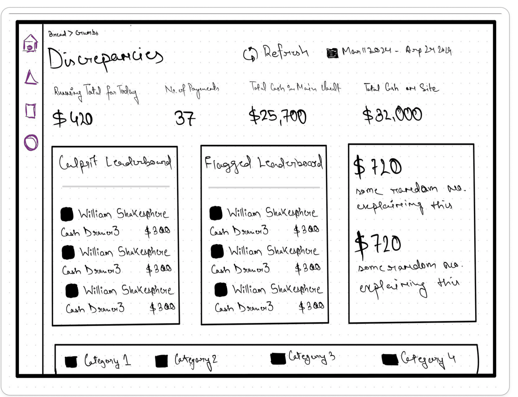
Leaderboard
based upon both budtenders & reasons.
These sections allows the store manager and stakeholders to efficiently monitor who are the people that are most likely to be responsible.
Features and Information Architecture
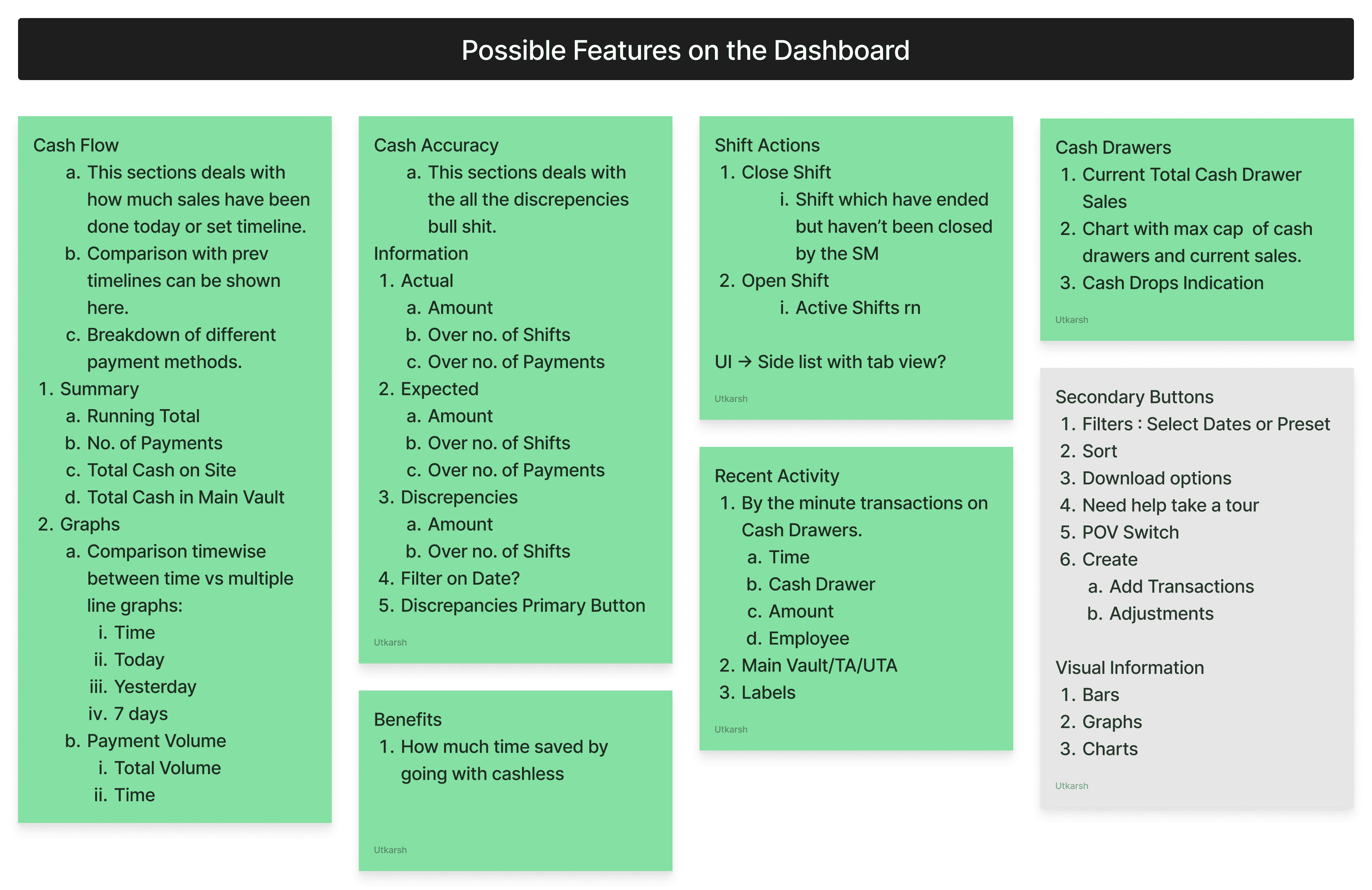
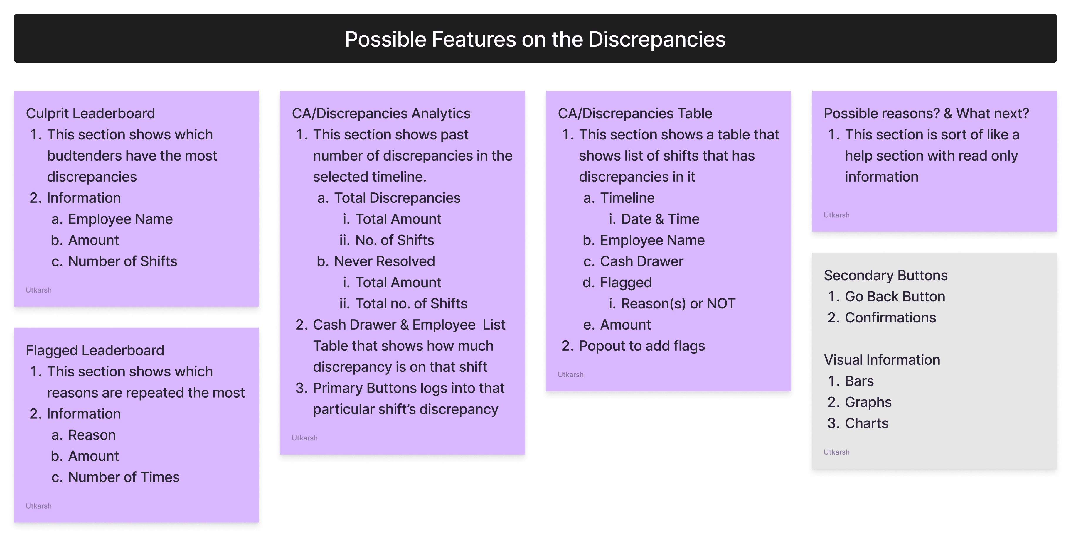
Key Screens
Reflections
What I'd do differently next time..
This was my first ever UX project 🎉. More than the actual output, however- I'm immensely grateful to have been through an entire ux process so I can utilize what I learnt from the past internships and the cohort. On that note here are few things that I learned:
Iterate as much as I can
Even though I had a pretty vivid idea of what I wanted to make after collecting inspiration, I should've made more different variants and get it tested out. This would allow me to have more confidence on my designs.
Scoping out my project faster
I spent a lot of time earlier in the UX Audit section, I went and tried to analyze the features of the product that weren't scope only and had this mindset to completely redesign the whole product segment as I saw problems in most spaces. I realize this type of behaviour in a professional setting would be very time consuming. Therefore I should've narrowed down my project initially only.
Be insight not process driven:
Despite a week of research + development, my first version of the case study was full of unnecessary text at this stage instead of tying everything into the bigger question - "so how does this fit into the bigger picture". Hence, I cut down the copy by more than 60% and focused on the major points in my project. Hence, going forward I believe focusing more on the insights will improve my storytelling ability to others.
🤝
Available for work
Have a project idea in mind? Let’s chat about how we can bring it to life— virtually, from anywhere in the world!
Introduction
Context
Treez is the leading enterprise cloud commerce platform providing point of sale software, retail analytics, cashless payments and integrated partner solutions to the highest volume retail operators in the biggest state markets in the cannabis industry. Treez's innovative technology and insights help retailers streamline their growth, increase their ROI, and drive efficiency in their operations.
Role
UX Designer
Timeline
2 Weeks
Why did I pick this project ?
I wanted to do a project for a overseas remote company. Also solving for the cannabis industry seemed something new and intriguing.
Industry
B2B Cannabis
Tools
Deliverables
3
Numbers of
Screens Created
27
For Research
I Went through 17 articles, 9 reviews and interviewed 1 participant
Process Followed
Problem Statement
(Re)-Design the Cash Handling feature to help merchants have greater insight into the whereabouts of their cash thus helping them better manage their finances & ensure timely recognition of revenue.
Expected
Amount
Actual
Amount
≠
EA is calculated from the
direct sale of products
AA is cash counted
from cash drawer at
the end of shift/day
Existing User Flow
The existing user flow although seems like a linear process but it only allows to view cash discrepancy for a particular shift only. It also has a additional optional step as well.
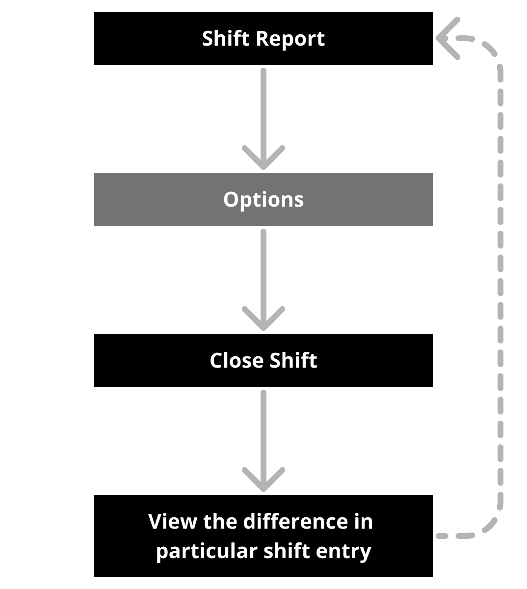
Shift Report
Options
Close Shift
View the difference in
particular shift entry
Secondary Research
Converting more customers to opt for cashless, results in better business for us…
Starting with secondary research, I began to draw from different product articles and blogs on the topic of discrepancies & business objectives. My goal was to learn more about what the customers think about the Treez Product and by achieving which business goals does Treez generates the most revenue.
That's when I stumbled across this video about Treez from Respect My Region that said:
"Loss prevention by reducing human errors results is the most efficient way to help a business scale and grow, this leads to higher baskets + higher end consumer retention for our customers"
Competitive Analysis
The competition didn't have a well established solution for handling discrepencies
While keeping the above statistic from Treez's article in mind. I analyzed the 3 most popular players in this industry. I found that none of them had this aspect of reviewing or gaining analytics on discrepancies. Therefore this gave me a point of intervention.
Apart from this I also analyzed the User Interface of all the competitors and got the following insight:
UI shouldn’t look like an excel sheet
Even other products of the Treez Suite has a good looking UI, which isn't in tune with SellTreez.
Interview Questions & Pod Call
Cash Accuracy process is time consuming and error prone, therefore not resulting in a clean slate the very next day
I got on a pod call with my mentor who works at Treez, he was our main source of primary information. I had a chat with him regarding on what's a usual day at one of the Cannabis Retail Store in US. He also explained all the terminology that is being used in Treez. Now following are the questions that I asked and were crucial for my solutioning phase:
Qns 1. What are the current reasons for mismatch?
Qns 2. What actions do Store Manager's take do in case of mismatch?
Qns 3. What part is time consuming and where do they generally commit errors?
Qns 4. What are the other personas that might interact with the software?
Qns 5. Do they go on the paper trail or conduct regular audits?
Qns 6. What's the current way of analyzing revenue?
Qns 7. Are the people working at the store also high?
UX Audit
The next step for me to go through each screen of the Cash Handling module…
I did this to note down what are the UX problems that a user might face. Additionally, I analyzed the User Interface to find inconsistencies and to filter out crucial information that should remain relevant in the new designs
User Story
Areas of Design Intervention
Initially I misunderstood the problem statement, I started to work on the overall IA of the overall Cash Handling Module. This was taking too much time and it was out of scope. Therefore,
I decided to create a flow of discrepancies in the Cash Handling module.
New User Flow
I planned to achieve this by starting from a dashboard like place for everything cash where you can further look into discrepancies by going to its dedicated screens. After concluding the primary research I concluded that it should ultimately end at a shift report.
Ideation & Solution
3 major improvements in my design
Based upon the feedback from my peers at 10kdesigners + my mentor, I came up with 3 major improvements for the
Cash Handling Module.
Cash Analytics
based upon payment volume
As the earlier screens didn't have any form of summary for how much revenue has been generated in the past.
Cash Accuracy
overview & Cash Drawers
A dedicated section in the new dashboard that gives details about the amount of discrepancies and the float amount in respective cash drawers.
Leaderboard
based upon both budtenders & reasons.
These sections allows the store manager and stakeholders to efficiently monitor who are the people that are most likely to be responsible.
Features and Information Architecture
Key Screens
Reflections
What I'd do differently next time..
This was my first ever UX project 🎉. More than the actual output, however- I'm immensely grateful to have been through an entire ux process so I can utilize what I learnt from the past internships and the cohort. On that note here are few things that I learned:
Iterate as much as I can
Even though I had a pretty vivid idea of what I wanted to make after collecting inspiration, I should've made more different variants and get it tested out. This would allow me to have more confidence on my designs.
Scoping out my project faster
I spent a lot of time earlier in the UX Audit section, I went and tried to analyze the features of the product that weren't scope only and had this mindset to completely redesign the whole product segment as I saw problems in most spaces. I realize this type of behaviour in a professional setting would be very time consuming. Therefore I should've narrowed down my project initially only.
Be insight not process driven:
Despite a week of research + development, my first version of the case study was full of unnecessary text at this stage instead of tying everything into the bigger question - "so how does this fit into the bigger picture". Hence, I cut down the copy by more than 60% and focused on the major points in my project. Hence, going forward I believe focusing more on the insights will improve my storytelling ability to others.
Creating a Cash Accuracy Flow for
POS Analytics
A product design case study for Treez.
🤝
Available for work
Have a project idea in mind? Let’s chat about how we can bring it to life— virtually, from anywhere in the world!
🤝
Available for work
Have a project idea in mind? Let’s chat about how we can bring it to life— virtually, from anywhere in the world!